
Tags
aesthetics, animals, animation, art, Beauty, cartoon, colours, creative, food, pokemon, writer, writing

Boh, Rattata, taro milk tea: what has a Ghibli character, Pokémon, and Taiwanese drink got in common? None of them—the first two are rodents while the last draws its flavour from a root vegetable—are supposed to be purple!
The fact that grey and conventionally unappealing animals and foods are often rendered a lovely shade of purple really tickles my fancy. Take Rattata, for instance. The aptly named Pokémon is clearly based on a rodent, but staying true to its real world counterpart’s greyish colour would reduce the Nintendo character to a mere cartoon rat, and where, pray tell, is the magic in that? Although (curiously) the same cannot be said about Rattata’s evolved form, the brownish, more rodent-like Raticate, it is clear that the former was coloured purple to distinguish it from ordinary rats, which most Pokémon players and viewers would find boring and/or repulsive, depending on how much they dislike nocturnal critters.


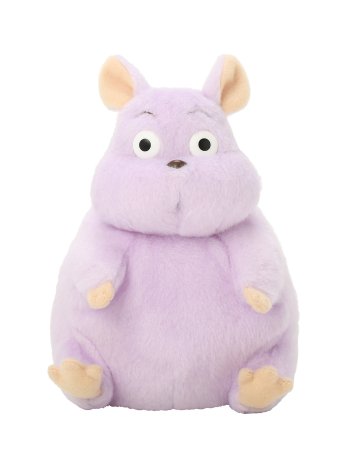
The same can be said about Boh, Spirited Away‘s spoiled boy-turned-rat ((b)rat to be punny), a cute, pastel lilac sack of fat, more kawaii plushie than actual mouse, as expected of Japanese animation. Disney’s Ratatouille, by contrast, offered a more realistic depiction of rodents in terms of shape, colour, texture, and movement: an excellent choice given that the film, through its loveable rodent foodie-cum-chef Remy, challenges the common perception of rats as pesky, food-stealing pests. But placed side by side in a shop, I’m certain that the chubby, pastel purple Boh plushies will sell out first, leaving a pile of skinny, grey, ratty Remys to gather dust.


In other words, creative license—a change of colour in addition to the usual cartoonisation of the animal—is used to make the characters more appealing and likeable, for the simple fact that aesthetically pleasing things are more likely to be popular, and therefore sell better. Aside from purple, blue is the other close-to-grey-but-not-grey option favoured by artists and marketers. This is why the Remy soft toy is a lot bluer than its animated counterpart. Maybe those stuffed Remys won’t gather dust after all.
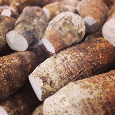
Colour play is also indispensable where food marketing is concerned. Taro, a dry and unsightly root vegetable that’s brown on the outside and greyish white on the inside, looks more ‘healthy source of fibre’ than ‘delicious way to add flavour and colour to a drink’. But taro milk tea, as we all know, is an enticing, milky shade of purple everywhere thanks to the miracle of artificial food colouring and flavouring. Inevitably, other taro flavoured delights, including pastries, buns, sponge cakes and mochi, are also pastel lilac and lavender. These desserts are so ubiquitous that, for East Asians, the word taro itself conjures the colour mauve instead of greyish white, the vegetable’s true colour. The way food and drinks look impacts our perception of its freshness and taste—in some cases our eyes can even trick our taste buds into believing that the food or drink is not as delicious as it actually is, just because it doesn’t look good. Who’d want to consume something that’s tinged with grey, right?

So here’s to makers of food and art, whose devious readiness for the fake and fantastical gave us magical rats and milk tea that does not resemble gruel of the Oliver Twist variety.

Haha that first gif is pretty neat
LikeLike